
| Versicolored Vermination |
VERMINATION.ZIP -- 781k 4 apr 1998 |
author: Roger Staines. this level begins with a fairly basic F1. the architecture throughout this level runs toward the larger end of the scale, yet just about every area runs smoothly and quickly. in many places textures have been used to accentuate and depict various types of architectural detail, but other areas are left oddly undetailed and somewhat bland. colored lighting has been used, and in just about every color imaginable, and, like the textural detailing, works in some areas and doesn't work in others -- the blending in a few notable areas borders on jarring. the flow is semi-linear and the pacing is good and challenging. monsters have been grouped and placed logically and effectively, and in some areas you're in for a good fight. the combat sequence after you get the security pass is notable for its difficulty -- this is how medics should be used. w00! :) secrets are hidden, but clearly marked, and i particularly enjoyed the secret with the grenade launcher in it. the endgame seemed a bit abrupt to me, but it fits in logically with the flow of the level. nitpicks: some slowing noted; monsters in secrets; and doors that only open one half at a time. a good first Quake2 effort from this author, but for whatever reason i wasn't able to really get into it.
| Vostok Rising |
VOSTOK.ZIP -- 830k 3 feb 1998 |
author: Ed Cope aka Scope. this level comes as a .pak file, and the .txt file contains accurate installation instructions along with a warning -- be sure to read the .txt file first! this level begins with you on a ledge in a mountainous area. the theme for this level has been done most excellently; you wouldn't think the Q2 texture set could be used to simulate a mid-19th century gold mine, but this level demonstrates otherwise. i loved the new sound files, which add to the immersiveness (and are good for a chuckle as well). this level is very large, but the running speeds are admirably smooth throughout. it does seem kind of empty at times, but i was surprised at how "un-plain" it really was; textures have been used wisely to add the illusion of detail. the one thing i noticed that this level has that no other add-on level has yet shown is monsters that drop stuff when they die. more of this, please. :) the flow is semi-linear, and the pacing is good, though the monster population is a bit light for a level of this size. weapons and ammo are sufficient for the task at hand, and you'll have no problem with having enough ammo to do the job. the colored lighting was used well, with areas blending seamlessly into one another. however, due to the scarcity of monsters, and the amount of real estate that you have to backtrack across, it can be slightly tedious going from one area to another. also, there is a spot where it is possible to become permanently stuck. the endgame fits the theme perfectly. this is just the first example of what's creatively and thematically possible with the Q2 texture set, and it's a good one. check this level out.
| Waiting to Die |
WAIT.ZIP -- 2,080k 22 jun 1998 |

author: Marty Howe. this archive comes packaged with three levels, the first of which shares the filename of the archive (which makes playing it a lot easier). all three levels exhibit excellent thematic continuity with the use of pop-up messages, architecture, lighting, ambient sounds, and flow/pacing... Marty is becoming quite the story-telling author with these multi-level releases (and how does he make them so fast?), and i'm definitely enjoying them. on to the show: the first map, entitled "Waiting to Die", has you starting in the cell of a prison ship (wow, does that plot sound familiar...) on your way to your fate. the origin fits perfectly with the theme, and the F1 is good and solid. every area in this level is proportional and convincing, as well as being well-detailed with either (or both) brushes and textures, as the situation permits. there is some notable slowing in places, however, but that's almost to be expected in a level where one huge object (in this case, the ship) has both an interior and an exterior that are playable areas... and the windows certainly didn't help. :) looks and plays wonderfully, though, and gives just the right feel. the author has also used ambient sounds deftly, especially in the appropriate areas such as the cockpit of the ship. the flow is linear and the pacing hard and excellent, with hordes of guards popping up to challenge your escape. i loved the secret. nitpick: it's possible to get permanently stuck in this level.
from there, you enter the "Execution Facility", which, presumably, was your destination anyway. the transition has been done very well, and the F1 is informative. this level features the same excellent architecture and texturing as the first level, and, unfortunately, shares the same slowing in spots; the first two-story forcefield area is particularly bad in this regard. nevertheless, the structures, lighting, and texturing truly give the feel of an execution facility. the flow is linear, with a somewhat-unusual path to take (interesting, though), and the pacing is tough and challenging without being annoying or overwhelming. the aggressive player will have a harder time with it than the cautious player. after returning to the first level, you proceed to the third.
"Hangar Installation" is where you'll be making your escape. the continuity in this level is very smooth from the previous, and the F1 is good. the architecture, lighting, and texturing follows the theme very closely, as usual, and is immersive in the extreme. flow is linear and pacing is satisfyingly difficult; the author whips out the big boys in this level in numbers, and you'll need all the hardware you've gotten up to now... and then some. combat is made more challenging by the odd flows of individual areas, so you'll need to think on your feet and quickly to survive. it's also made more challenging by the running speeds; in the area pictured in the bottom screenshot, the game ran very choppily, making fighting more difficult than it had to be. also, the ship entities, while cool-looking, have very odd bounding boxes, and maneuverability around them is bizarre, to say the least (which isn't the fault of the author). if the bounding boxes just prevented movement, that'd be one thing, but you're sometimes pushed in another direction or movement is slowed as if you were moving through syrup. very odd, unpredictable, and difficult to compensate for. the endgame fights are insane, but a lot of fun. nitpick: it's possible to get permanently stuck in this level.
all in all, a most excellent gaming experience, and another that comes highly recommended.
| Water Works |
WATER_WORKS.ZIP -- 1,094k 15 feb 1998 |

author: Doug Magee. this archive contains two .bsp files, intuitively named COLNT1A and COLNT2A. the nice thing is the first calls the second smoothly and logically. the F1 in both levels is good and informative, and introduces/advances the plot nicely, though no CD track has been specified. the action starts immediately in the first level, and really doesn't stop until the endgame of the second one. your mission is clearly defined, and it's up to you to get the job done. the architecture throughout is very well done, though in some areas the detail gets a bit heavy, slowing the game. in addition, the opening to the second level is very slow, probably due to the flowing water present. some HOM was noted by the base of the coolant tower in the first level, though that was the only place where it was present. colored lighting has been done well, as has the architecture; the structures and detailing in both levels, but especially in the first one, are superb. i loved the coolant tower in the first level and the various camshafts and water paddles in both. monster placement and selection, on the whole, was good, although some oddities were noted (leaping berserkers?) the ambient sounds have been used extremely well; there aren't many areas where you can't hear some machinery humming or grinding busily away. not a lot of monsters present, but the strength of these levels is definitely exploring them, and there certainly is a lot of exploring to do. i stumbled into the end of the first level before i was really ready, but you can go back if you'd like. the second level has a lot of slowing in it, especially at the very beginning as well as in the back tunnels on your way back up to the top (by the dam). good pacing in this one as well, and the railgun definitely came in handy. (i was able to jump to the railgun from the room in the bottom screen shot, but it wasn't easy; try it.) the endgame for the second level is appropriate, but i drowned once before i figured out where i was supposed to go. all in all, an excellent pair of levels from this author, and a fun game that comes recommended.
| Weapons Distribution Facility |
WDF.ZIP -- 893k 22 jun 1998 |

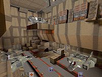
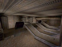
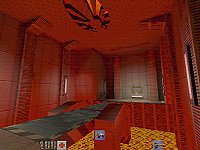
author: Ian '[SnAzBaZ]' Packer. this archive contains two levels designed to be played in a linear fashion, with the first level having nearly the same name as the archive, making it easier to start the game. "Weapons Distribution Facility" begins with a good origin and strong F1, though the text overlaps the graphic. the architecture through this level is fairly stark, but the author has added enough detail structures to give the level some needed depth. textures have been chosen with care to add depth as well, and due to both factors, the level plays very smoothly in all areas. the textures have also seemingly been chosen with an eye to camouflaging the monsters, as i found it difficult to see many monsters against the textured backdrop. this is an interesting effect that i wouldn't mind seeing more of, because it makes the monsters seem more intelligent by having them disguise themselves, in a way. play areas are fairly large in size, but some, like the area in the top screenshot, have a little "clutter" added to them to make them a bit challenging to negotiate. the flow is linear and the pacing very challenging; the author has used the smaller/weaker monsters to good effect here, giving them good positioning and making them harder than they usually are. you'll nearly always have the weapons you want, but the ammo is in fairly short supply, so choose your shots wisely. specials have been used well, in particular the turret in the middle screenshot (which was so cool i had to put it in there). this one is very very hard to kill, as well, as there is simply nowhere to hide from it; the swivel/pivoting mechanism on this turret enables it to cover every single spot in the area shown. logical, realistic, and difficult... but beatable. (tip: don't use your limited supply of grenades on the tank.) this level is basically very well put together, and very well balanced, to give a challenge to the die-hard single player.
the transition from there to "Transportation Central" is smooth and logical, as is the introductory F1. the architecture in this level is, for whatever reason, very plain, and the level itself is very short, but don't let that fool you -- this level sports some of the best running combat situations i've yet played. the monster strength rises sharply here, but since the monsters drop the relevant hardware (you get both the rocket launcher and the railgun in the first bright room), you'll be more than adequately armed... after you kill them, of course. the flow here is linear (there are really only three rooms, with one connecting corridor, after all) and the pacing, as noted, is brutal and a whole lot of fun. the bridge mechanism (that lowers the bridge in the bottom shot) is very cool. the end of this level is a bit abrupt (i expected the door to open, not the level to change). nitpick: if you shoot the tank commander from across the pit, and he's too close to the edge when he dies, the red key drops into the lava, making further progress impossible.
a very nice pair of levels for those who like good combat. get them now.
| Blood-Red Sunset |
YSPQ5.ZIP -- 635k 14 may 1998 |
author: YooShin Yang. this level begins with a good F1, an excellent intro/origin point, and a CD selection. the architecture in this level is, as usual, extremely well-done, with both textures and detail brushes being used to create a sense of place. play areas vary in size, with most being of the medium-sized variety... in other words, roomy enough when you're by yourself, but exceedingly crowded when gunners start flinging grenades. this type of architecture serves to lull the player into a sense of complacency, and that's an attitude you don't want to have when you're playing one of this author's levels. the flow is linear, with side areas to explore, and the pacing is (again as usual) semi-brutal. monsters pop up behind you and come out of hiding spots next to you and lurk above you and basically give you a hard time. the nice thing is they're balanced well against the weapons and ammo you're given (with monsters dropping appropriate items; notable exception is the jacket armor one of them drops when killed)... though health seems a bit scarce. this is also the first level i've played where the berserkers have been placed effectively. some architectural niceties in this one, to be sure, including the massive central two-stage elevator (very cool) as well as the first good use of texedge i've seen. finally, the author has used pop-up messages excellently to advance the plot, and the use of ambients and .wav clips adds to the immersiveness. secrets are fun to find and provide good bonus items, seemingly just when you need them most. this one is a blast to play through, and comes recommended.
| Station Zebo |
ZEBO.ZIP -- 2,164k 15 mar 1998 |
author: Travis Almand. this archive contains four different .bsp files, and unlike previous multi-level offerings, these levels can be played in just about any order (starting with zebo1.bsp). all levels share excellent running speeds and a solid adherence to theme; the F1s are concise and appropriate, but they don't seem to reset from level to level. also, all four levels are linear with some side areas to explore; needless to say, you won't get lost.Storage (zebo1) is a basic storage area; very blocky, filled with boxes (and what seems an abnormally-high amount of ammunition) and walkways. this level is pretty bright overall, and there are yellow security lasers blocking off a couple of doors, which i was never able to get through.
Water (zebo2) is some kind of processing plant -- pools of liquid abound, as do control room areas, piping, and assorted pumping machinery. the predominant color in this level is blue, with blue lighting, water, and textures being used more than any other (besides the dark grey of the machinery and pipes themselves), giving this a definite "water" feel. security lasers are present in front of a couple of doors and, not surprisingly, they're blue. again, the level is fairly straightforward, with little backtracking necessary, and again, there is a whole lot of ammo for your use. pacing is good, though; monsters are placed well and are relatively tough, based on the architecture you're encountering.
Waste (zebo3) is a processing plant for, you guessed it, waste. when i played through it, the layout seemed kind of familiar, and after checking the .txt file, my guess was correct -- Waste is Water with a different color and texture set; the architecture is virtually identical. monster placement is different enough to keep you from getting complacent, though, and i got a couple of nasty surprises along the way. security lasers here are green. another well done linear and fast-running level.
Control (zebo4) is the last level of the four, and differs markedly in quality of architecture; this one is much more convincingly built, as it has more detail, a wider variety of textures, and a bit of semi-linearity. the predominant color here is red (texture sets, lighting, lasers). no goals or secrets in the F1, but i laughed out loud at the F1 that popped up after i blew away the big ol' chunk of machinery... try it and see. save first, though. :) heavy duty monster population in this one, so be glad you've got a lot of ammo. not a lot of health to be had, which makes it that much more challenging.
all in all, a good, workable "hub" series of levels; nothing really groundbreaking in regards to design or texturing, but the fact that the author has made a non-linear set of levels (that actually do change when you come back to them) is remarkable in and of itself. as to the security lasers: i was able to shut off the green and blue ones (in other levels, no less) but i never figured out how to drop the red and yellow ones. i'll be looking forward to another set (not soon, i gather; making four levels like this has to take some time), and hopefully the next set will be more intricate, carry a stronger plot, and be a bit more immersive.