Q2CTF Map Editing
The following is a general guide to
follow when creating Quake2 maps for Capture the Flag. It is not a die-hard set of rules
that shouldn't be broken. The information comes from playing CTF for well over a year and
a half (at time of authoring this text), and creating many CTF maps myself.
--Hal 9000
Getting to know the CTF entity set
There are very few entities for Q2CTF, and are extremely easy to use. They are:
| item_flag_team1 | Red team flag |
| item_flag_team2 | Blue team flag |
| info_player_team1 | Red player start |
| info_player_team2 | Blue player start |
| misc_ctf_banner | Hanging banner |
| misc_ctf_small_banner | Small hanging banner |
The flags are placed in the map in the bases. Very simple and straightforward.
The player starts are where the players will spawn when the map first begins, or a new player enters the game. They are not used again by players in the game. For the duration of the level, info_player_deathmatch entities are used for respawns. The player starts should all be in or very near each team's base, and you should include a minimum of 8 for each team. You should also include at least 8 deathmatch starts located around the central map area, and not near the bases.
The ctf banners are simply a decoration, like the banners seen in map base1 outside the building. Give this entity a spawnflags of 1 for blue or no spawnflags for red. The banner is 248 units tall, and the origin of the entity is the bottom center of the banner. So place it 248 below the spot you want it hanging from.
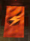
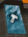
These are the two banners. Remember, to get blue, use spawnflags 1.
The small banner is essentially the same as the banner. The same spawnflags apply for it as well. The small banner is 124 units tall. The origin is also the bottom center of the banner, so place the entity 124 units below where you want it hanging from.
This is what I like to call a gray area. For some people, huge sprawling maps are great for CTF, for others, they hate them. I'm in the middle; there should be plenty of room to move about, but not so much it takes five minutes to get from one base to the other. On the other hand, the map should not be so small that 8 players makes it feel like the mosh pit at a Pantera concert. There are two basic types of CTF map layouts:
- Mirrored
- Random
- Mirrored maps are just what the name implies: both
sides, blue and red, are identical, with connections between them. These are the best maps
for CTF, because both teams are playing on even ground, with the same layout to defend and
attack. These are also much easier to make, because you only have to create one-half of a
map. Depending on your editor, you may be able to copy and paste the whole side, rotate
and mirror it, and align it for the other side. Then minor texture changes (red to blue,
or vice versa) are neccessary.
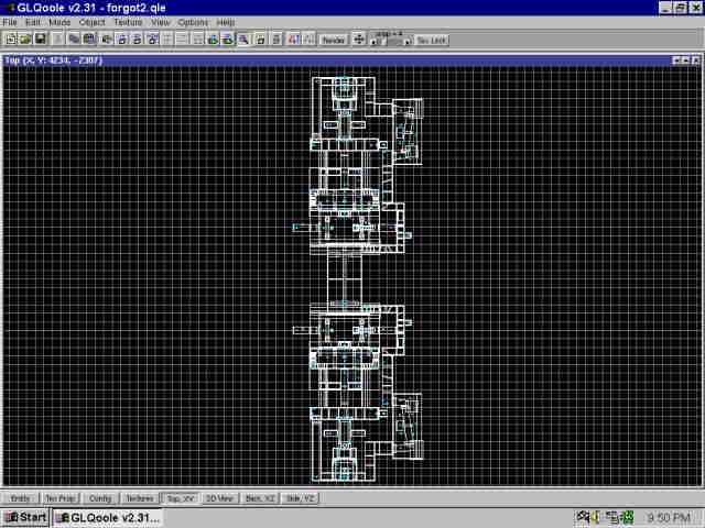
This is an example of a mirrored CTF map in Qoole. As you can see, both sides are identical (bases are at extreme ends).
- Random maps tend to be more interesting than
mirrored maps, but are usually unfair to one team or the other. In the case of random
maps, one base may be defensively superior to the other, rendering the opposing team
unable to pull off a successful attack. This was the case in a few of the original Quake1
CTF map conversions from original id levels in the game. If you are going to make a random
map, try to make both bases equally difficult to attack.
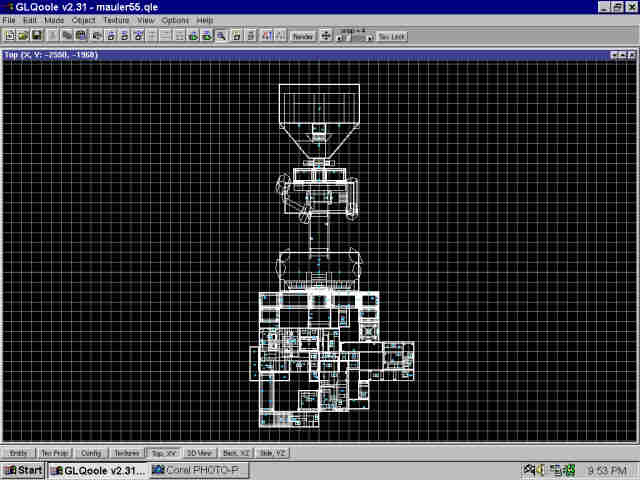
This is an example of a random CTF map. Each side is different, providing a more interesting layout.
- Hazards or traps are great to have in any map, but keep them to a minimum in a CTF map. The point is for team play, and not individual nastiness to players. Lots of lava or slime in main thoroughfares is not a good idea. Keep traps like that confined to locations where powerups, or stronger weapons are (see more on this below, in the weapons & powerups section).
- Doors and lifts should be quicker than in normal maps, but dont make them blaze open in a flash -- if you're going to do that, then dont bother putting a door in. Sometimes you want to slow the player down a bit; not always do you want the player with the flag to be going full speed through the map. Give him or her a few obstacles to overcome.
- Textures should be chosen appropriately, so that
there are lots of red textures on the red side and blue on the blue side. Be sure to use
plenty of the two colors in all areas, so players will know which side of the map they are
on at all times. Colored lighting should also be coordinated with the base colors.
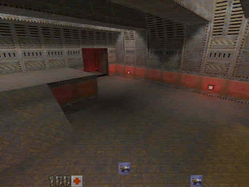
This is an example of a red team base. The red wall texture lets you know right away where you are.
A BFG10k ten feet from the flag is not good weapon placement. An invulnerability and quad in each base is not good powerup placement. This is the point of the following section. I've seen a lot of CTF maps that have the biggest and baddest stuff all right there, in the bases, making it nearly impossible to attack. This is not fun CTF.
- Only the low to mid strength weapons should be in the bases. Shotgun, supershotgun, machinegun, chaingun, and railgun should be kept within the base. Grenade launcher, rocket launcher, hyperblaster, and BFG10k should be placed in the central areas between the bases. This forces defenders to step out of the base for a moment to gain a stronger weapon to defend with. The BFG10k especially should be placed somewhere in the map where it is difficult to obtain.
- The bases should have plenty of all types of ammo. Lots of shells, bullets, and slugs. Less of ammo such as rockets, cells, and grenades. Stockpiling rockets or cells within the bases means players can keep themselves loaded up to the max with the strongest weapons while defending, once again rendering a successful attack almost impossible. Try to place the heavier ammo away from the bases, more out in the central areas, where the player must leave the base momentarily to get these more powerful ammunitions.
- Powerups like the quad and invulnerabillity should
be in central areas, or trap-like areas that make it difficult for the player to get to
them. Zoid had a great spot for the pentagram (invuln) in CTF2M1 ("McKinley
Station") for Quake1, where it was placed in a little room, in a main hallway, which
could only be accessed by standing on a pipe, shooting a button that opened the door, then
walking over a lava pit on the pipe to get the pentagram. High risk for high reward is key
for big powerups.
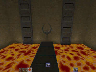
Here's an example of a hard-to-reach powerup. The player must risk falling in the lava to get the quad.
- Overall, CTF maps should be fairly simple layouts, with few obstacles for the player. Complex, winding, maze-like maps should be avoided; they work well for single player, but are tedious for people in a CTF game.
- Try and come up with the most interesting designs for the bases that you can. Make sure there's plenty of good guarding spots (but none that would be impossible to attack) for the team to defend from. Always give your bases more than one way in and out. The more options one has for attacking, the more interesting the gameplay is.
- Keep in mind CTF is multiplayer, and therefore you
should watch closely your R_SPEED poly counts. You should have no areas that rise above
450 wpoly, as they will create latency for players on slower systems. Be sure to use
func_areaportals and hint brushes wherever possible to keep the polys low.
- Once again, these aren't rules etched in stone that
cannot be broken, but rather guidelines to follow for creating the most interesting and
fun maps for CTF. Follow some of the key points made here, and your maps will turn out
extremely enjoyable for [just about] everyone that plays them.
Questions & Comments
Quake Workshop2
